Data visualizations
Independent director pay at “top 50” companies
Data visualizations show median, highest, and individual director pay; reveal change over time; rank companies.
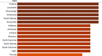
Abandonment of poor: much worse than you thought
The maximum value of public assistance benefits has fallen dramatically in every state between 1970 and 2011 for families of three.
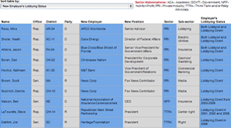
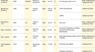
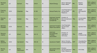
Judicial vacancies: show us the numbers
New tools allow easy access to and filtering of 12 years of data. How long did George W. Bush take to nominate? President Obama? For the Senate to act?
Government support for arts down dramatically over time
When adjusted for inflation and population, per capita funding in 2011 down 33 percent from 1983.
One graduation for all or add-on ceremonies for minority students?
What is done at flagship public universities and at top-rated private schools?
The incredible shrinking federal workforce
When taking into account the growing size of the population, most parts of the federal civilian workforce are effectively much smaller than they were in 1978.
Workers’ out-of-pocket health insurance costs to go through the roof?
If employers move to a “defined contribution” model, most likely “yes.”
Brother, can you spare $829 billion?
America’s largest corporations are holding lots of cash, cash equivalents, and short-term investments. This viz breaks it down for 2012, 2006, and 2000.


