Data visualizations
Get email updates and share our reporting
All our latest original reporting, data visualization, interviews, and more!
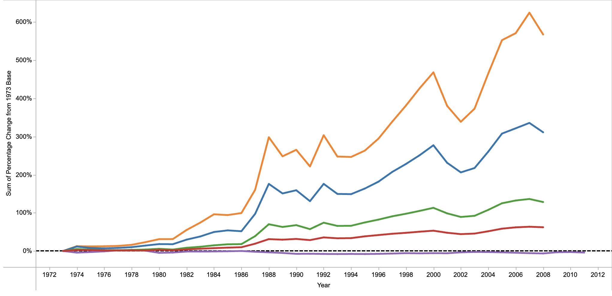
Aftermath of 2008 economic collapse: biggest global banks still...REALLY big
3 new visualizations on banks deemed "globally systemically important."
More U.S. kids in poverty than people in your state?
Unless you live in Cal., Tex., N.Y., or Fla., yes. Number of children in poverty, child poverty rate, and scope of race and ethic disparities all up.
Growing set of state abortion restrictions visualized
Tools allow user to make custom assessment of impact in each state.
Who's been lobbying for whom?
Remapping Debate's new tools allow for a detailed view of the interests served by ex-lobbyists employed as key staffers in this or the last Congress (searchable by staffer or "client").