Data visualizations

Get email updates and share our reporting
All our latest original reporting, data visualization, interviews, and more!
Demographics of the 12 "fast tracked" community districts
Hiding in plain sight: the desegregating impact of applying the "fast track" affordable housing approval process to the 12 communities districts that have had the lowest production.
Exclusive: culture results for Legionella-positive cooling towers obtained
First-time look at results from Upper East Side cluster. Results confirm prudence of Health Department's proactive management once outbreak was discovered.
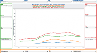
Our upgraded unemployment tools
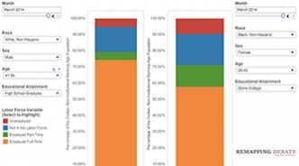
These tools provide ways to look far more deeply into unemployment data -- current data and data over time. You have the ability to compare and contrast up to four demographic composites, each with a race/ethnicity, gender, age, and educational attainment element. Updated with latest (May) data on June 15th.
How white is Medicaid in Trump country?
Medicaid cuts, which could result in millions of Americans across the country losing health coverage, may appear politically palatable to those who subscribe to deeply-held stereotypes about Medicaid recipients (and all recipients of state-administered “welfare” programs): they are mostly Black and generally live largely in urban centers. But look at what the data say.