Map & Data Resources
| | Gender equity, Health | | Education |
| | Education | | Civil rights, Housing, Race |
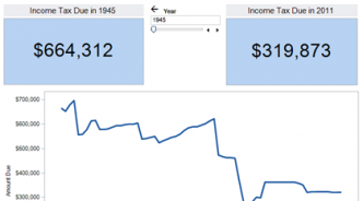
| | Taxes | | Employment |
| | Open government | | Open government |
Recognizing that public policy making involves choice, not submission to inevitable facts of life that always have been and always need to be.
| | Gender equity, Health | | Education |
| | Education | | Civil rights, Housing, Race |
| | Taxes | | Employment |
| | Open government | | Open government |