Map & Data Resources
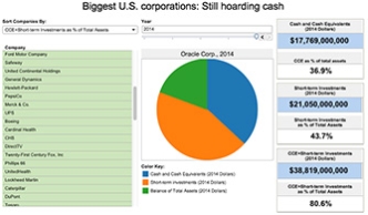
| | Corporations, Economy | | Income inequality, Labor |
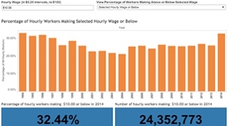
| | Employment | | Unemployment |
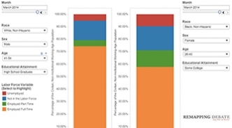
| | Income inequality | | Energy, Taxes |
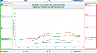
| | Education | | Law, Politics |
Recognizing that public policy making involves choice, not submission to inevitable facts of life that always have been and always need to be.
| | Corporations, Economy | | Income inequality, Labor |
| | Employment | | Unemployment |
| | Income inequality | | Energy, Taxes |
| | Education | | Law, Politics |