June 4, 2014 — As the Obama administration’s proposal to raise the federal minimum wage to $10.10 from $7.25 an hour remains stalled in Congress and many low-paid workers call for the minimum wage to be raised to $15 an hour, this new visualization from Remapping Debate provides a picture of how much most hourly workers make an hour, and how that has changed over time.
The data used here are for workers paid at hourly rates, not for workers who work on a salaried basis. (In the first four months of 2014, those paid at hourly rates represented about 58 percent of all wage and salary workers.)
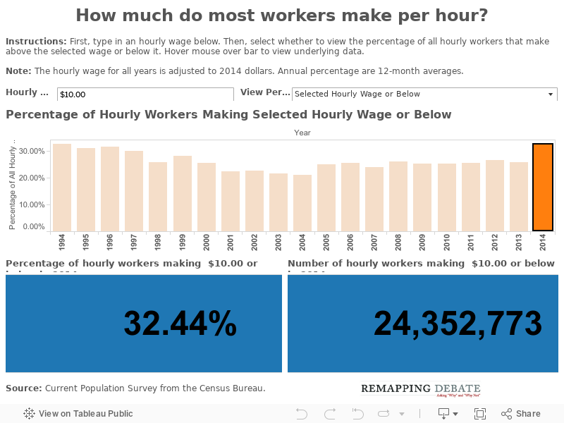
All data reflected in the visualization are adjusted for inflation to 2014 dollars. These data — from the Current Population Survey of the U.S. Census Bureau — show that the percentages of workers at various pay levels have not changed significantly between 1994 and 2014 (although the absolute number of workers at most levels has increased due to increasing population).
In the first four months of 2014, for example, 32.44 percent of all hourly workers made $10 or less an hour, representing 24,352,773 workers. In 1994, 32.72 percent of workers made the equivalent amount in 2014 dollars when adjusting for inflation ($6.25), representing 21,866,963 workers.
To put that amount in context, a full-time worker earning $10 an hour makes approximately $20,000 a year. That’s well below the poverty threshold for a family of four with two children, which was $23,624 in 2013. A full-time worker making minimum wage only makes about $14,500, less than two-thirds of the poverty line for a family of four.
In order to earn at least 150 percent of the poverty line (that is, to not be in a “near poverty” state), a sole full-time worker in a family of four with two children would need to make at least $17.70 an hour. More than 70 percent of hourly workers made below that amount in 2014.
To explore these data in the visualization, first enter an hourly wage (up to $100, in $0.25 intervals). Then select whether to view the percentage of workers making above the selected wage or making the selected wage and below. The visualization automatically adjusts the hourly wage entered to 2014 dollars in all previous years.
Then, to view the percentage and number of workers for particular, click on the bar corresponding to that year, and the percentage and number of workers represented will appear in the blue boxes at the bottom of the visualization. When you switch from “at or below” to “above” (or visa versa), the year you selected in no longer highlighted in the bar chart but the data for that selected year are shown in the boxes at the bottom of the visualization.
Note: The annual numbers of workers and percentages represent 12-month averages in every year except for 2014, when they represent the averages of the first four months of the year.