Data visualizations

Get email updates and share our reporting
All our latest original reporting, data visualization, interviews, and more!
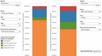
Visualize disparities in unemployment
These tools provide ways to look far more deeply into unemployment data -- current data and data over time. You have the ability to compare and contrast up to four demographic composites, each with a race/ethnicity, gender, age, and educational attainment element. Updated with latest (May) data on June 15th.
Major capital improvements in rent-regulated buildings: still landlord-friendly
The element of the system that has not been getting much attention is how landlords of rent-regulated apartments recoup costs for major capital improvements (MCIs) — things like new roofs, boilers, windows, plumbing, and electrical wiring.

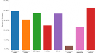
How white is Medicaid in Trump country?
Medicaid cuts, which could result in millions of Americans across the country losing health coverage, may appear politically palatable to those who subscribe to deeply-held stereotypes about Medicaid recipients (and all recipients of state-administered “welfare” programs): they are mostly Black and generally live largely in urban centers. But look at what the data say.
Biggest U.S. corporations: Still hoarding cash
Invest in growing the economy? Nah. Biggest publicly held companies had cash and cash equivalents and short-term investments of more than $740 billion in the latest period we examined.
Who makes what?
New visualization shows that the percentages of workers at various pay levels have not changed significantly between 1994 and 2014. Interactive tool allows you plug in any hourly wage up to $100 in 25 cent intervals.
January [2014] unemployment analytics
In the most recent data, the 12-month moving average of the unemployment rate was available for 258 distinct demographic composites. Out of the 20 demographic composites with the highest 12-month moving average of the unemployment rate in December (ranging from 23.48 percent to 51.57 percent), 14 were Black, Non-Hispanic; 14 were between the ages of 16 and 25; and 15 were demographic composites with an educational component of “less than a high school education."
Who earns what?
Two new data tools. Which occupations have so many high paid workers that they bust the current BLS survey method's ability to measure closely?
Updated judicial vacancies tool: big reduction in median time to Senate action
Senate action on 20 pending nominations combined with 15 new nominations by Obama result in very different snapshot from six months ago. Will new picture last? Tools allow look at all judicial vacancies since 2001.