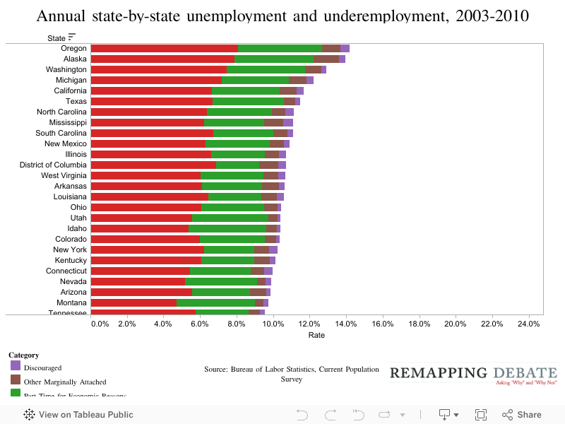
Nov. 16, 2011 — The chart below, using “Alternative Measures of Labor Force Underutilization for States” produced by the Bureau of Labor Statistics, shows the average annual percentage of the civilian labor force that falls into each of four categories of unemployment and underemployment in each of the 50 states for the years 2003 to 2010. To see how the rates change over time, move the slider in the upper left-hand side of the visualization through the years.
The statewide unemployment rate is represented in red. The percentage of the civilian labor force that is working part-time for economic reasons — meaning individuals who want to be working full-time but are unable to find full-time employment — is represented in green.
The category of marginally attached workers includes all workers who had looked for a job sometime in the prior year, but who had not searched for a job anytime in the prior month. (These workers are not counted as unemployed.)
Discouraged workers — shown in blue — are a subset of marginally attached workers that includes those who, when asked why they had not searched for work in the prior month, gave the specific reason that they believed no jobs were available for them. Marginally attached workers who gave any other reason why they had not looked for work in the prior month are represented in orange.
This chart, using the same data source, enables a quick view of how unemployment and underemployment within a state changed over time. Simply choose a state in the upper right-hand corner of the visualization to see how the rates have changed over time.
In each year, the statewide unemployment rate is represented in red. The percentage of the civilian labor force that is working part-time for economic reasons is represented in green.
Discouraged workers are shown in blue, and marginally attached workers who gave any other reason why they had not looked for work in the prior month are represented in orange.