Mapping and analysis of new data documents still-segregated America
January 18, 2011 — In the first analysis of new 5-year data from the American Community Survey at the Census Block Group level, Remapping Debate has found that reports that a long-term trend towards greater integration “overall” has continued leave out fundamental aspects of current-day residential reality. Census Blocks Groups represent smaller geographic areas than do Census Tracts.
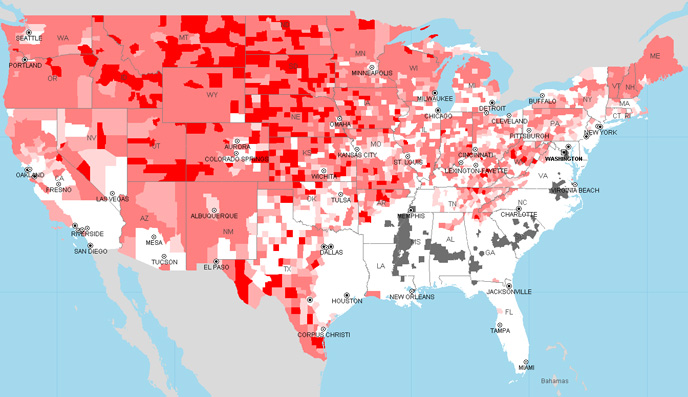
Working with tools provided by Social Explorer, Remapping Debate is also releasing interactive maps that can zoom down to the Census Block Group level anywhere in the United States, revealing high levels of segregation that are cloaked at larger geographic levels (see example in the box at the end of this article).
Key data findings
It turns out that these ACS data, covering the period 2005 to 2009 and released last month, reveal that:
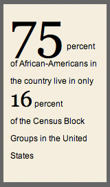
In a country that is only 12.1 percent African-American, 30 percent of African-Americans live in Census Block Groups that are 75 percent African-American or more.
75 percent of African-Americans in the country live in only 16 percent of the Census Block Groups in the United States.
50 percent of African-Americans live in Census Block Groups that have a combined African-American and Latino population of 66.85 percent or more (nationally, the latino population is approximately 15.8 percent, so the combined African-American and Latino population is just shy of only 28 percent).
Mapping tools
The new maps, available here, highlight areas that remain ultra-white, as well as areas that are disproprortionately African-American or Latino or both.
Instructions for using the maps
- When you go to the maps, use the second drop down menu on the right to choose among 3 maps.
- Tip: Use the “find” tool above the map to navigate to specific address, city, zip code, county, or other place of interest.
- Zooming and panning tools are available above the map.
- Note that it takes several clicks to go from the national level to the census block group level.
- Tip: Holding down left mouse button will allow you to draw desired geographical area.
- Tip: once geographical area selected, you can toggle among the maps and will stay at the chosen geography.
For the map that looks at African-American population, one is able to identify those Census Block Groups that have zero African-Americans, less than 1.0 percent, from 1.0 percent to less than 2.0 percent, and from 2.0 percent to less than 3.0 percent. One can also see those Census Blocks Groups that are 50 percent African-American or more. In other words, the areas highlighted are those that are have an African-American population no more than one quarter the national population of African-Americans, or an African-American population that is more than four times the national percentage of African-Americans. Go to the maps.
For Latinos, the maps delineates areas under 7.0 percent Latino (less than half the national average), and 50 percent or more Latino (more than three times the national average). Go to the maps.
The last of the maps shows demographic combinations in Census Block Groups that have less than 3.0 percent African-Americans and less than 7.0 percent Latinos, as well as those that have either African-American or Latino population of 50 percent or more. Go to the maps.
If there are questions about the use of the maps, or if you have suggestions for additional mapping and data resources that you would like to see Remapping Debate make available, please us the “contact” webform available at the bottom of the page.
A wealth of additional demographic information — including mapping of data as far back as 1790 — is available on the Social Explorer website.
You have to zoom in to make racial segregation fully visible
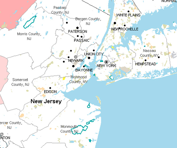 | 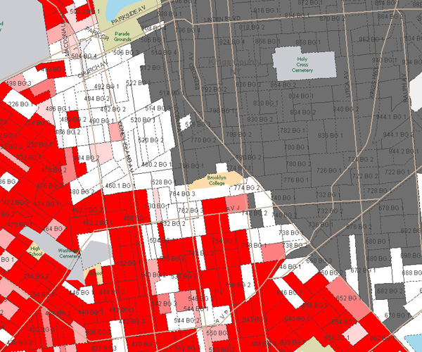 |
When looking at the metropolitan New York area, for example, a county-level view can conceal a lot (see the image on the left). Aren’t there areas of very low and very high concentrations of African-Americans? Zoom in. At the Census Block Groups level (see image on the right), gross racial segregation becomes obvious. In Brooklyn, New York, there is a very clear divide along Flatbush Avenue.
Remapping Debate thanks Ahmed Lacevic, the Vice-President and Chief Software Engineer of Social Explorer, for his assistance.