For many groups, unemployment rate hasn’t dropped much since post-crash high
Sept. 25, 2013 — When you’ve looked for monthly unemployment data, you have probably noticed that you can pretty readily find those data sliced by race or gender. Sometimes you can find the data arranged by age group or by educational attainment.
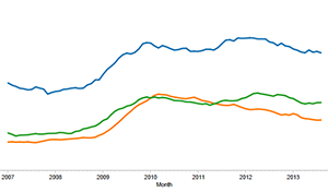
Three demographic composites at a time
Map & Data Resources
Resolution at least 1280 X 1024? Click here
But each of those dimensions — race or ethnicity, gender, age, and educational attainment — operates concurrently to create a discrete demographic composite. Each such composite has its own unemployment rate, and the the rates look very different from one another.
Last year, Remapping Debate created a striking new set of interactive tools to allow you to explore how each of these factors works together, and we now update the data every month.
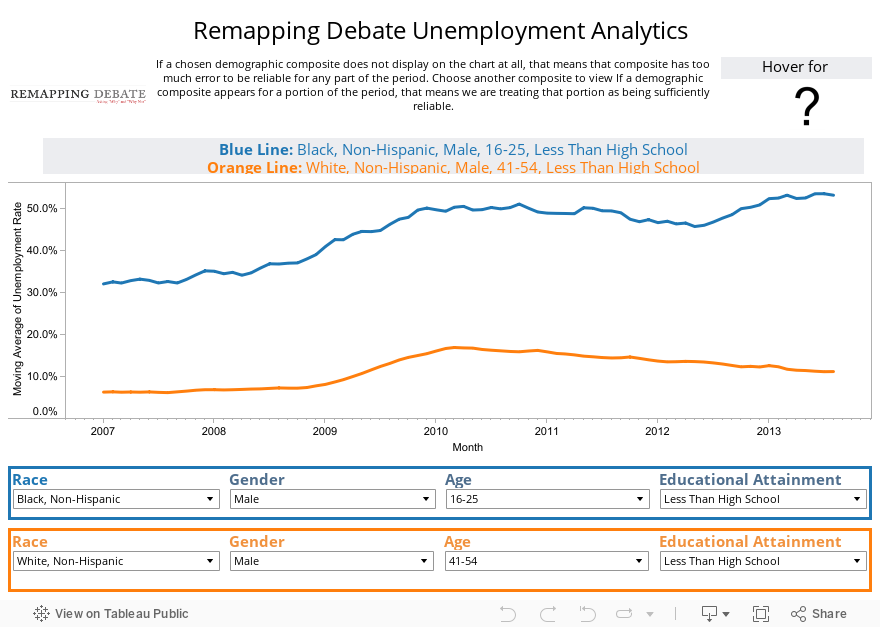
What we do is analyze unemployment data from the Current Population Survey of the Census Bureau (the data that are used by the Bureau of Labor Statistics) from 2006 to the present — data for August 2013 (released in full by the Census Bureau’s Current Population Survey earlier this month) are now integrated. In order to account for seasonal variation and to reduce the margin of error, the results reported for each month represent a moving average of that month and the preceding 11 months. Thus, for example, the first month represented in the visualization is Jan. 2007, comprising a moving average of the months from Feb. 2006 through and including Jan. 2007.
While the 12-month moving average of the unemployment rate for every demographic composite has decreased from its highest point since the recession, many composites remain strikingly near that peak.
In fact, out of the 260 composites for which the data are sufficiently reliable, the 12-month moving average of the unemployment rate for 165 demographic composites is still at least 75 percent of its post-crash high. For 22 of those composites, the current 12-month moving average of the unemployment rate remains at least 90 percent of its post-crash high.
For each of the eight months in 2013 for which data are availabe, the 12-month moving average of the unemployment rate for African-American men between 16 and 25 years of age with less than a high school diploma has been higher than any month from 2007 through 2012.
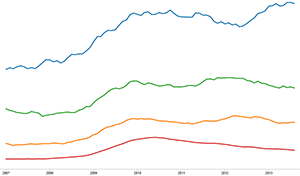
four demographic composites at a time
Map & Data Resources
Resolution at least 1600 X 1200? Click here
We have three flavors of the visualization, depending on your screen resolution. The one that appears directly below only requires a resolution of 1,024 x 768. It allows you to select two different demographic composites. If you want to compare and contrast three demographic composites at once, you need a screen resolution of at least 1,280 x 960, and you should click on the pop-up box to the left. If you want to compare and contrast four demographic composites at once, you need a screen resolution of at least 1,600 x 1,200, and you should click on the pop-up box to the right.
Note: We started with 300 demographic composites. When one of them had a standard error equal to 10 percent or more of the unemployment estimate for a 12-month moving average, that 12-month moving average does not appear in the visualization (you will see in a limited number of cases that the line that graphs change in unemployment rate over time is not complete). In those cases in which every month’s moving average was at or above our standard error threshold, you won’t be able to create the particular composite at all.
That said, there are more than 270 composites available. No 12-month moving average that is reported has a margin of error (+/-) of more than 4.5 percentage points (at a 90 percent confidence level). In most cases, that margin of error (+/-) is substantially less.
Along with the graph that tracks change over time, the visualization reports the overall average of unemployment for the entire period, the highest and lowest 12-month moving unemployment averages for the entire period, and the current 12-month moving average (August 2013 is the most recent reporting date).
Selected a composite, but no display appears? That’s because you’ve come upon a composite with too high a standard error. Select another composite!
On the next page, the data are organized in table form and allow you to sort each of the available demographic composites by average, highest, lowest, and current 12-month moving averages of unemployment.