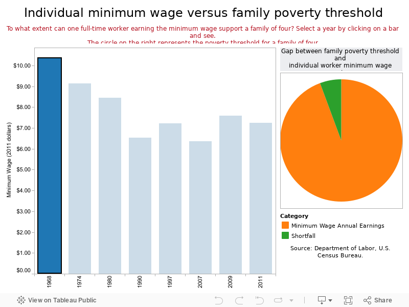
Apr. 11, 2012 — As observed in recent news coverage, “lawmakers are facing growing pressure to raise the minimum wage, which was last increased at the federal level to $7.25 an hour in July 2009.” But what does the federal minimum wage look like when placed in some historical context? The chart below, with all figures expressed in 2011 dollars, goes back to 1968, and shows that today’s federal minimum is signficantly less in real terms than it was then.
We also wanted to see how well or poorly one person working full-time (40 hours per week, 52 weeks per year) at the minimum wage could support a family of four. Even in 1968, the family of four that relied on one person earning minimum wage had income that fell short of the poverty threshold for that family size. What was a modest shortfall then in percentage terms is much bigger now, albeit not as great as it was in 1990 and 2007.
The entirety of the pie chart on the right represents 100 percent of the poverty threshold for a family of four. To see the gap between that threshold and the annual earnings of a minimum wage worker for a particular year, click on the bar representing that year. When you place your cursor over the pie chart, you can see the underlying inflation-adjusted figures.