Map & Data Resources | 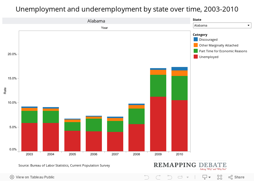
This chart, using the same data source, enables a quick view of how unemployment and underemployment within a state changed over time. Simply choose a state in the upper right-hand corner of the visualization to see how the rates have changed over time.
In each year, the statewide unemployment rate is represented in red. The percentage of the civilian labor force that is working part-time for economic reasons is represented in green.
Discouraged workers are shown in blue, and marginally attached workers who gave any other reason why they had not looked for work in the prior month are represented in orange.