Map & Data Resources
Data from W-2's allow closer look at income higher on the wage scale
Map & Data Resources | 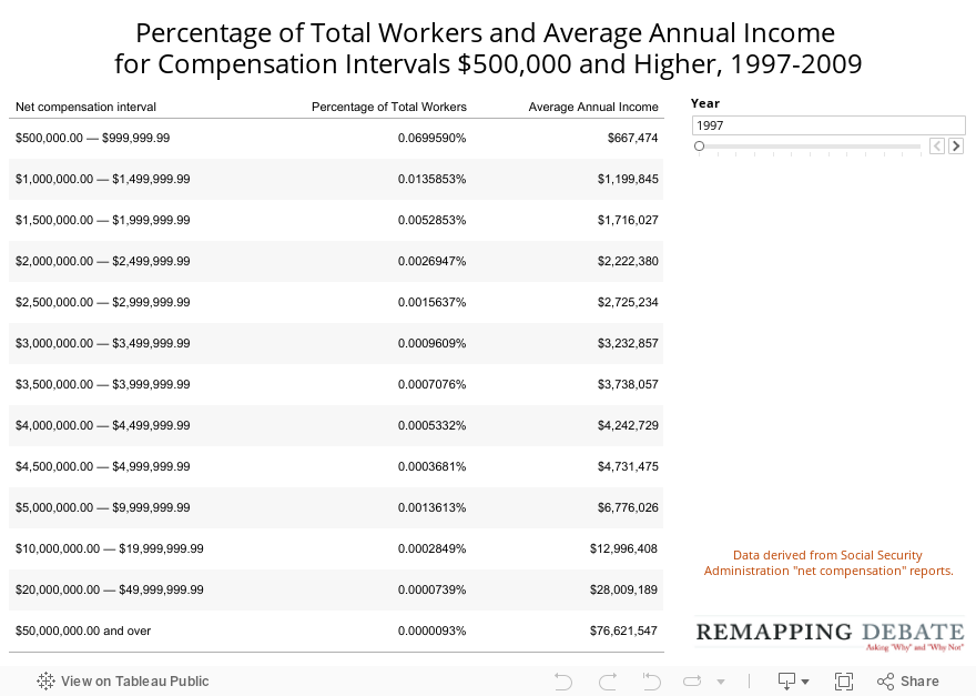
Sometimes, the best visualization may be doing it the old-fashioned way. This table begins with the income interval that, on the previous chart, was the highest income level. But here, as the percentage of total workers rapidly declines (seen as more zeros to the right of the decimal place), the average annual pay rapidly rises
Pages
- « first
- ‹ previous
- 1
- 2
- 3
- 4