Map & Data Resources
Data from W-2's allow closer look at income higher on the wage scale
Map & Data Resources | 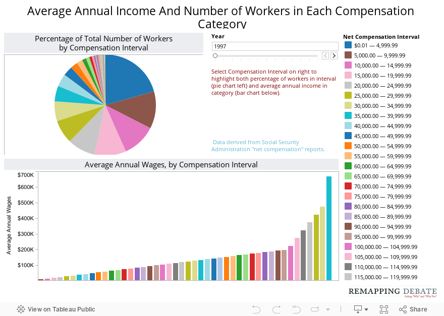
On this chart, the bar graph shows average annual wages by compensation interval. When selecting an interval (most easily done via the list on the right), the pie chart reveals the percentage of all workers in that income interval. Once again, the scale of difference at higher income levels does not permit levels at the $1 million and up mark to be depicted on the same visualization.